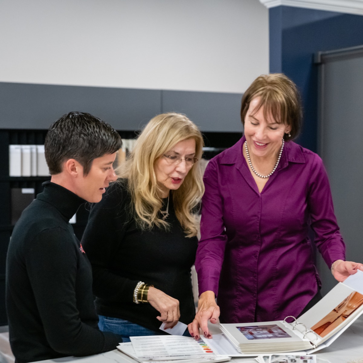
Comprehensive Interior Color Consultation
This package goes deeper into your design style. Our expert curates up to six paint colors that complement cabinetry, flooring, furnishings, and finishes, with additional colors offered at extra cost.
Starts at $365
Book a 15min Discovery Call to discuss your project or Book your Consultation Now
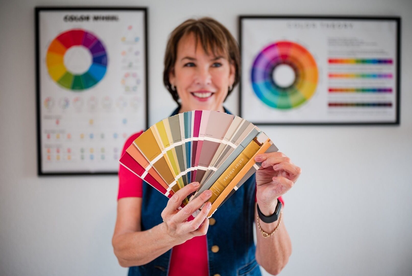
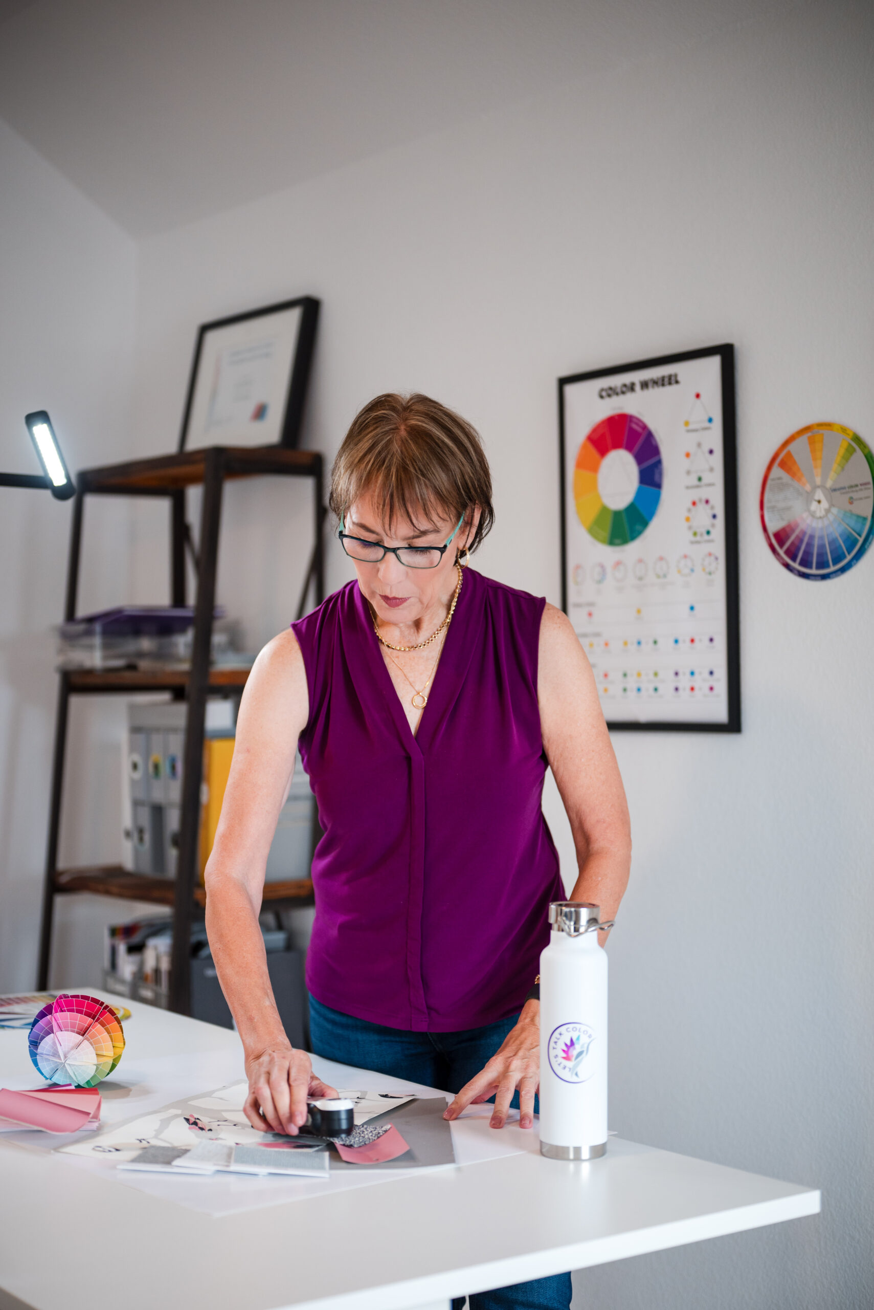
Standard Color Consultation Interior
Choosing one color isn’t simple—lighting, undertones, and existing elements add complexity. This package creates a balanced palette for walls, trim, and ceiling, ensuring harmony and flow.
Starts at $325
Book a 15min Discovery Call to discuss your project or Book your Consultation Now
Exterior Color Consultation Existing Homes
Our expert reviews every detail—roof, siding, windows, doors, and stonework—to create a cohesive exterior palette. You’ll receive a tailored color plan that matches your home’s style.
Starts at $365
Book a 15min Discovery Call to discuss your project or Book your Consultation Now
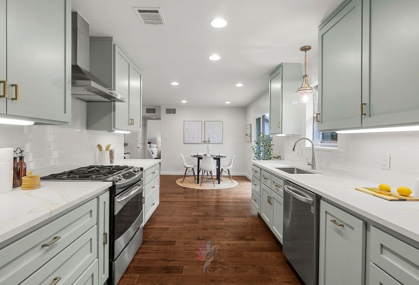
Kitchen Renovation
Updating a kitchen is more than new countertops. With my proven 6-hour package, you’ll select finishes and materials that refresh your space, reflect your style, and flow seamlessly. Extra time billed hourly.
Starts at $750
Book a 15min Discovery Call to discuss your project or Book your Consultation Now
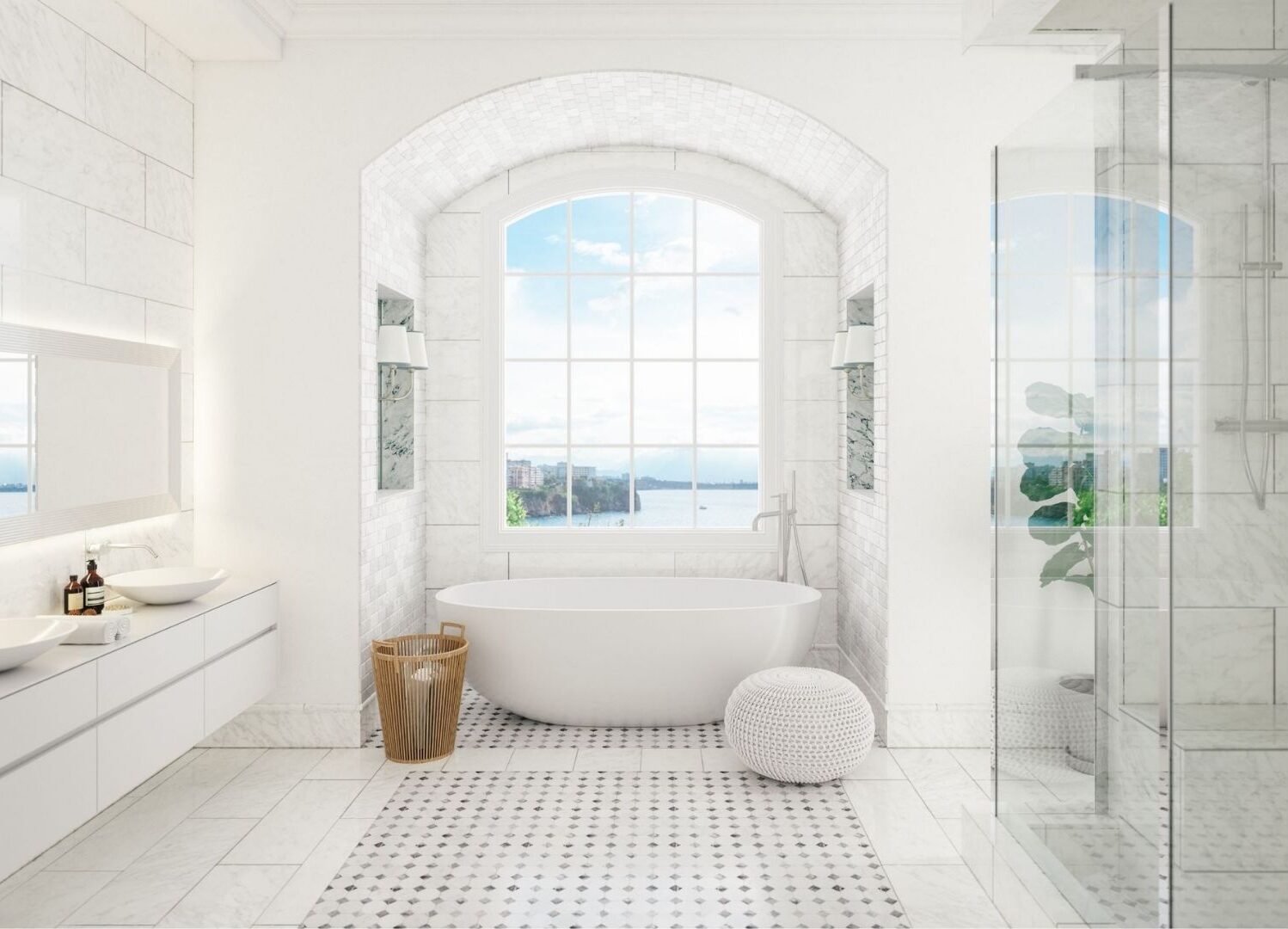
Master Bathroom Renovation
Planning a bathroom remodel? In this 6-hour package, our expert helps you choose paint, tile, countertops, and fixtures for a cohesive design. In-person consults included, with extra time billed hourly.
Starts at $750
Book a 15min Discovery Call to discuss your project or Book your Consultation Now
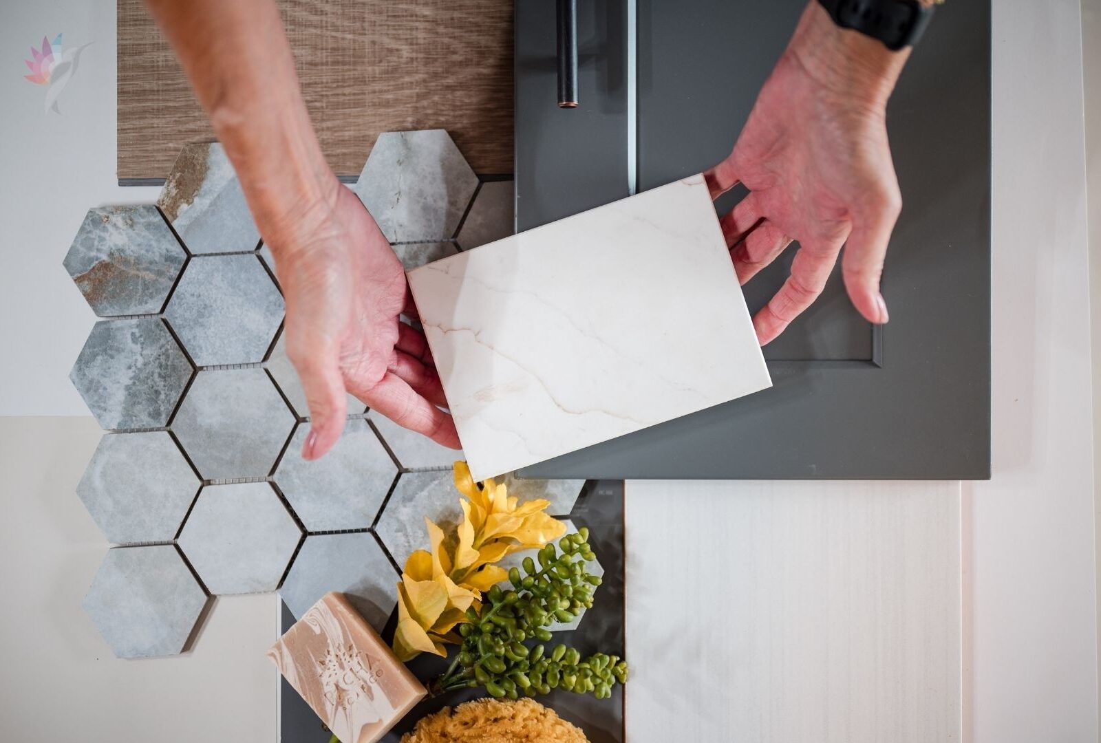
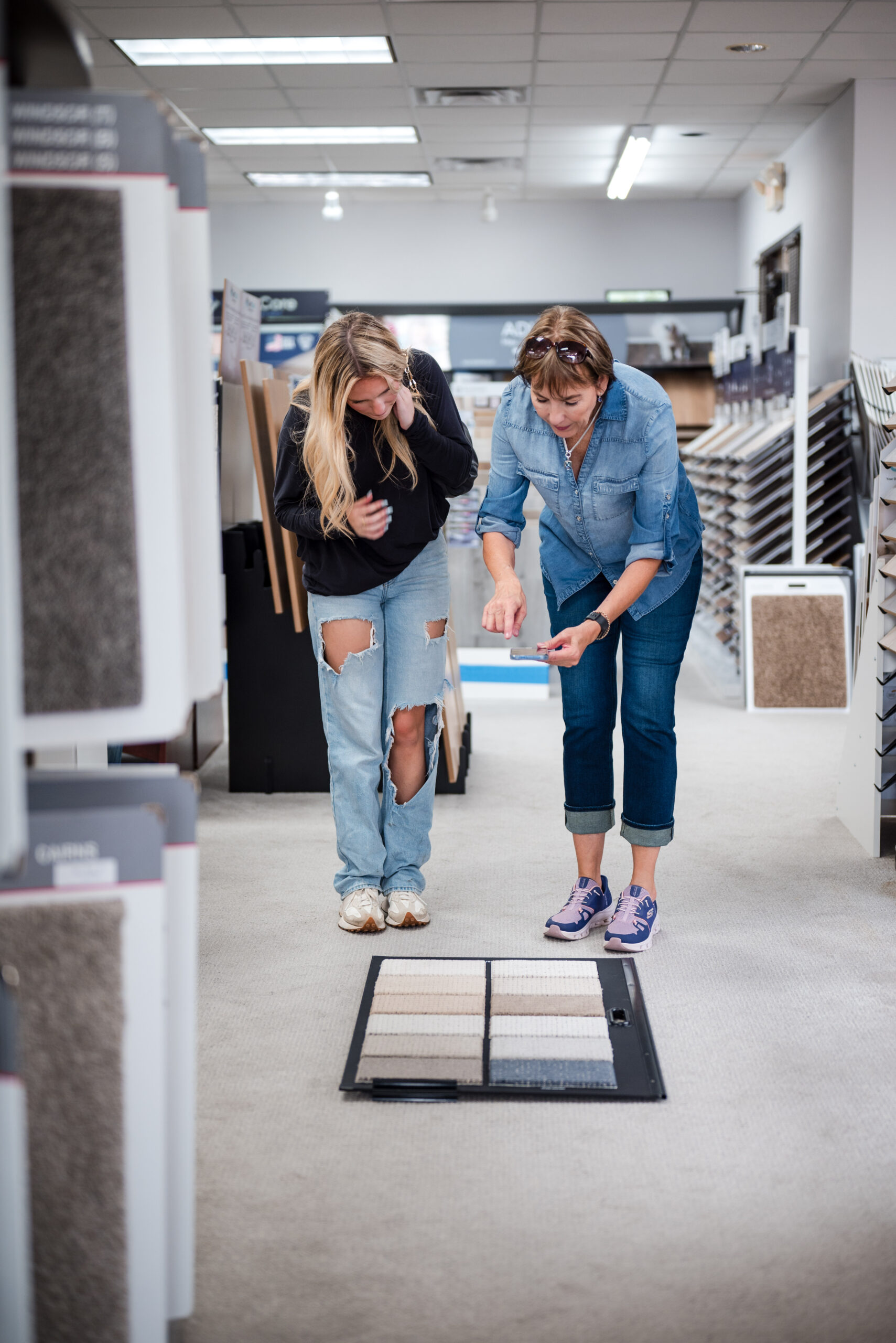
Interior Fixed Elements
New Construction or Remodeling
Building or remodeling? This 6-hour package ensures flooring, tile, countertops, cabinets, and paint colors align seamlessly. Our expert meets with you (and designer if needed) at your builder’s center or location.
Starts at $997
Book a 15min Discovery Call to discuss your project or Book your Consultation Now
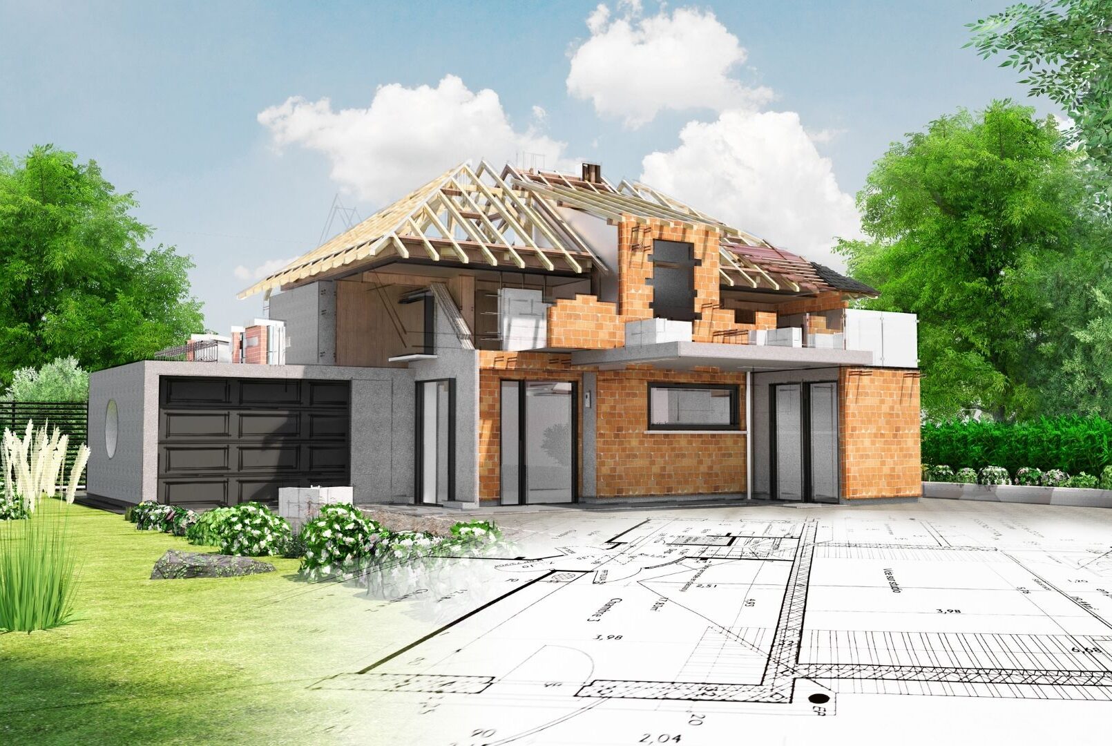
New Construction
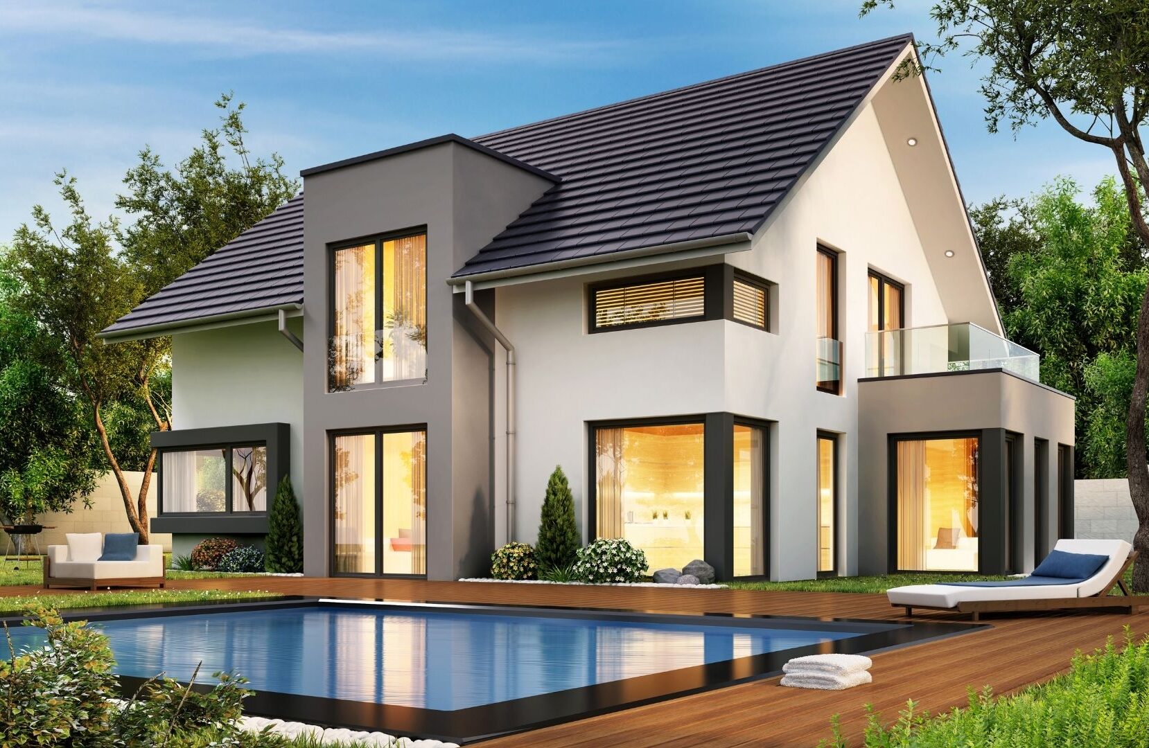
Exterior Color Consultation
Our New Construction package creates a cohesive exterior palette by selecting paint, roofing, and stone finishes that align with your home’s design, ensuring seamless color harmony from the start.
Starts at $897
Book a 15min Discovery Call to discuss your project or Book your Consultation Now
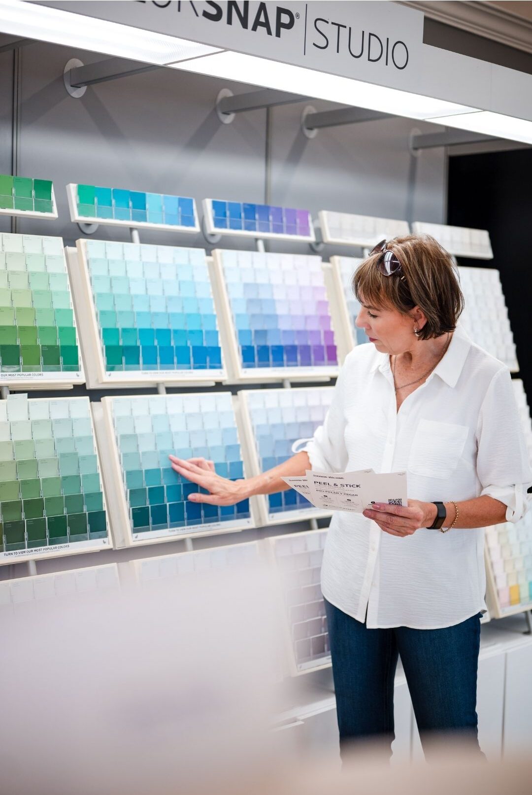
Virtual Color Consultation
Virtual Consultations let us guide you remotely to choose your color palette with confidence. Paper samples mailed; painted samples optional. Consultation must be prepaid after the Call.
Starts at $350
Book a 15min Discovery Call to discuss your project or Book your Consultation Now
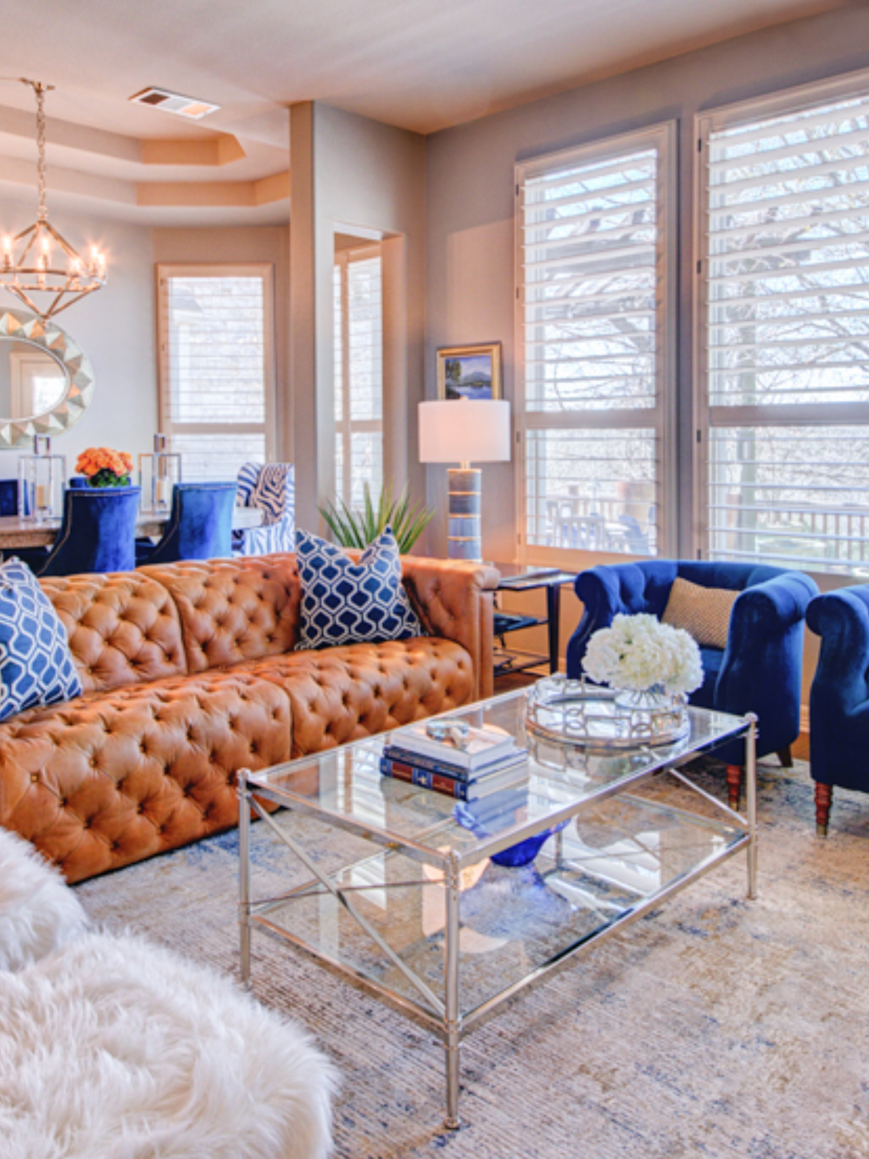
Full Day - Same day services
Perfect for new homeowners or post-remodel, this 6–8 hour package includes furniture placement, artwork, kitchen organization, and styling with your accessories. Excludes unpacking, closets, or garage.
Starts at $1,150
Book a 15min Discovery Call to discuss your project or Book your Consultation Now