Years ago, 2010 to be exact, when I was still fairly new in the field of Home Staging and Redesign, Darlene asked me to help her with updating her kitchen. At that point, all I had done, were a few minor redesign projects in her house.
I was primarily a Home Stager at that time and although we learned about the basics of color, I did not have the confidence to make selections for any of the fixed elements to update the kitchen. I didn’t know anything about countertop materials, hinges, hardware, sinks, and all the details that go into a project like this! Just the idea of choosing a new countertop seemed really daunting to me!
But I was very excited about the possibility of having some input into having the kitchen updated, that’s for sure! I desperately wanted to open it up, let more light in, and get rid of the tiles on the countertop, so I introduced her to an Interior Designer who specialized in kitchens and bathrooms.
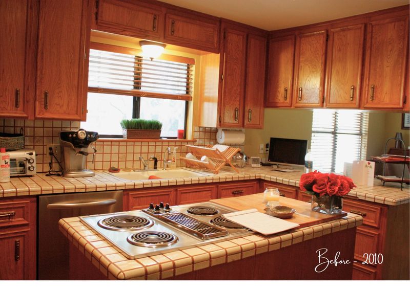
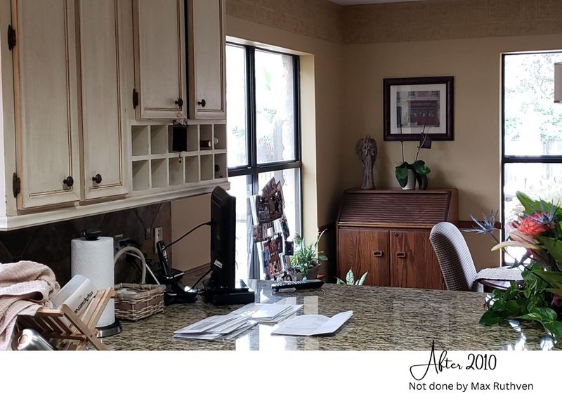
I wasn’t involved in choosing anything in the process. It was way out of my comfort zone! The updated kitchen looked much better than the original version, but I always wondered about all the “busyness”
Busy granite, busy paint colors, the backsplash was replaced with the same slate floor tiles! I guess it was the trend at that time. The green paint on the island seemed wrong to me with the slate floors. Corbels were added to the cabinet corners and a very ornate scroll was added to the island.
It all just made me feel restless. I felt as if I wanted to clean it all up. With a wet cloth! I learned later during all my intensive training courses how to identify what was going on. There were so many competing elements in one space!
The granite countertop didn’t work with the multi-color slate floors. The paint on the cabinets looked dirty. The new backsplash was actual floor tiles, which was not a good fit with the granite at all, especially because it touched it directly.
Long story short, as time went by, Darlene got tired of the busy “dirty” look as well and decided she wanted a change! This time around I felt much more confident, and I am so pleased with the outcome!


Slate tiles have so many earth-tone colors in them. You need to choose a definite hue, meaning charcoal, green, red, maroon, brown, etc. and then narrow it down to the correct tone and value of that specific color. It is not an easy task, to say the least.

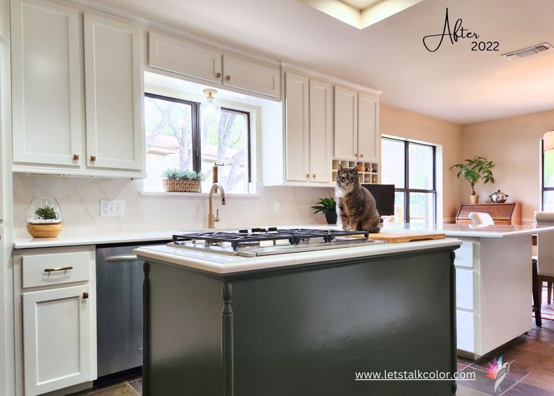
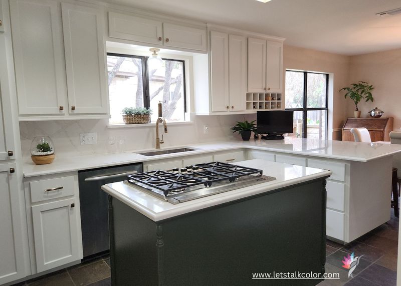
The cabinet hardware color of choice was Champagne Bronze. I love the warmth it brings into any space and yes, it is totally fine to mix your metals! The stainless steel Ruvati workstation did not “fight” with the Champagne Bronze faucet we bought from Lowes. And all the appliances are stainless steel as well.

In the image below, you will see that we continued the Calacutta Gold Quarz onto the backsplash which gave it a clean, simplified, and seamless look. It doesn’t have a busy, distracting pattern and after having to look at the green slate tiles that were used for the backsplash before, this look was much more calm and serene!

And since the rest of the house has already been painted and it is still fairly traditional, we chose to pull the colors through to the kitchen to create a cohesive flow throughout the house. The wall color is Manchester Tan HC-81 from Ben Moore and the cabinet paint color is Swiss Coffee OC-45. It looks great against the slate floors as it is not a stark pure white.

If you are ready to update your kitchen, now is the time! Call me! Things are getting more and more expensive. No more procrastinating! 🙂