Torri and Rob are very near and dear to me and I felt so privileged to have met them! They were excited and enthusiastic about the changes and the everything I suggested, which of course, made me love the project and the challenges and I was almost sad once it was done.
But they moved not long after we were done and I got to repurpose almost everything they had again, giving it a totally new look and feel, by changing the accent color percentages!
Since I am not a turn-key designer, I always try and work with what is already in the house and then just add to it as the budget allows. Using color in an effective creative way, is my ultimate goal.
When they called me to come and help them with their house in Shoreview Overlook, the request was to “pull it all together”
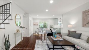
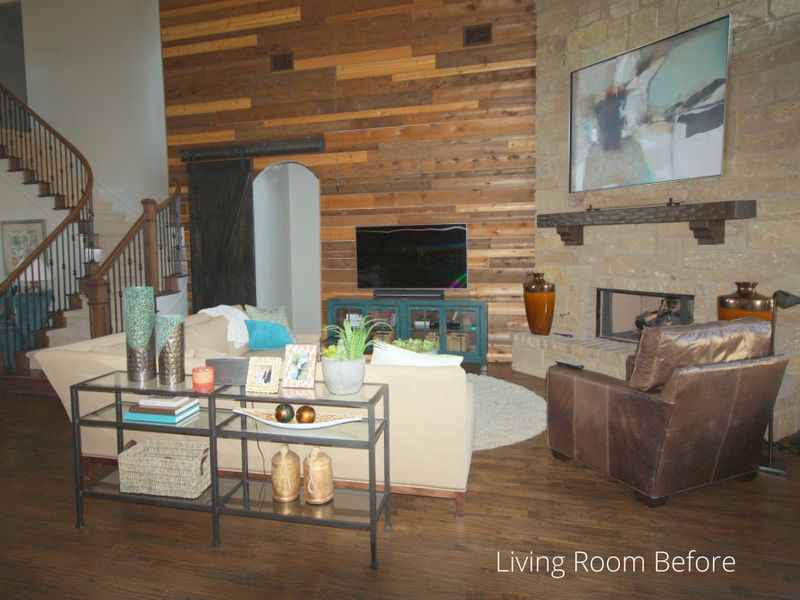
As you can see in the ”Before” picture below, there were some colors already to work with, but as she said, it felt unfinished and not well-designed. Since the walls and trim were painted in gray very recently, changing the wall color was not an option. I didn’t have a problem with the wall color though, it was neutral enough.
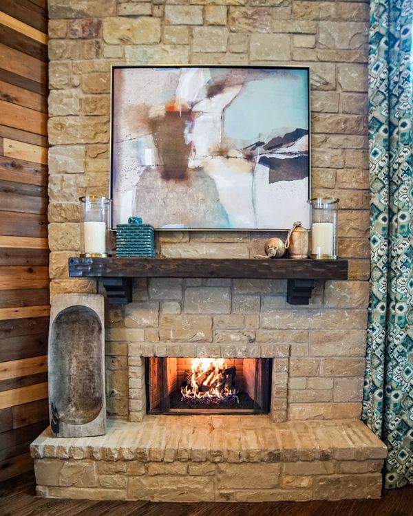
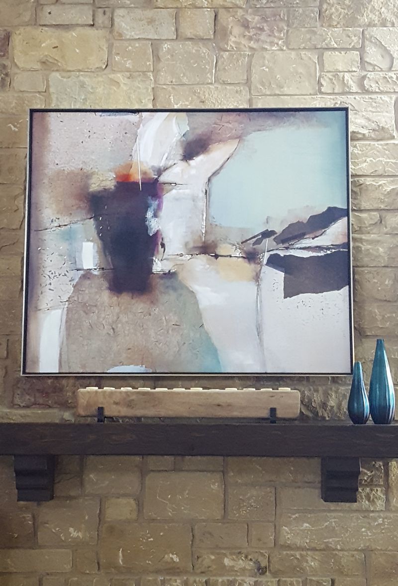
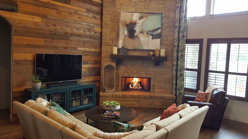
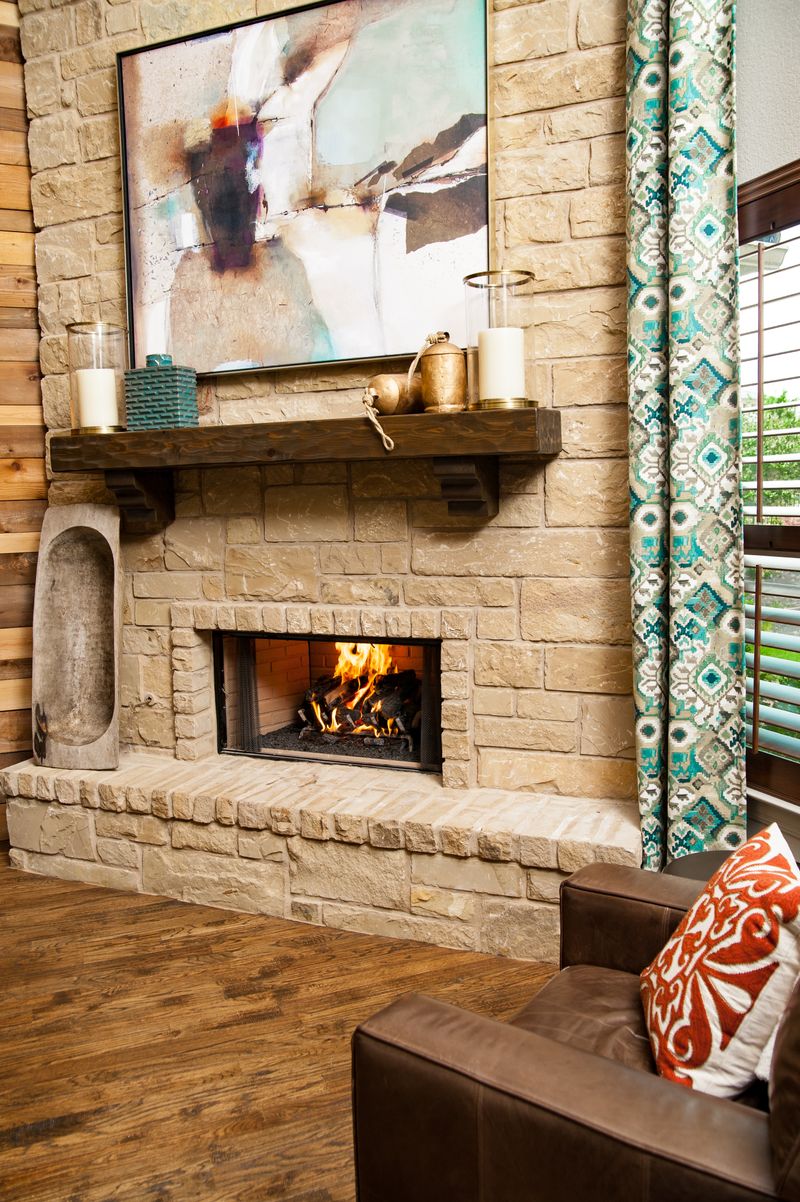
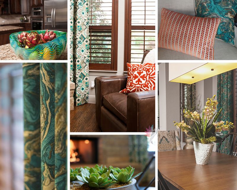
The artwork above the fireplace was my color inspiration as well as the TV Console, which was a very strong turquoise color, leaning more towards green hue family
One thing I have learned quite early in my Decorating career is that, if you want your house to look like a model home, then you should absolutely consider professional draperies! We discussed the options. As you can see, the wall next to the fireplace is very tall, probably about 20ft high, so it was not going to be an inexpensive choice. But with so much brown and stone in the house, even the kitchen was yellowish and brown, curtains were almost the only way to add a wow color factor to the room!
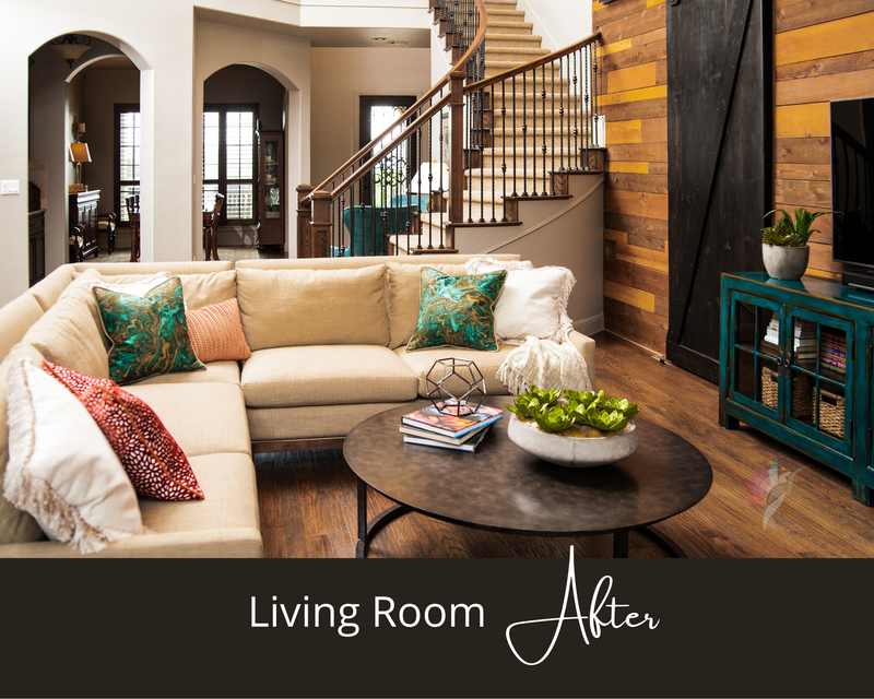
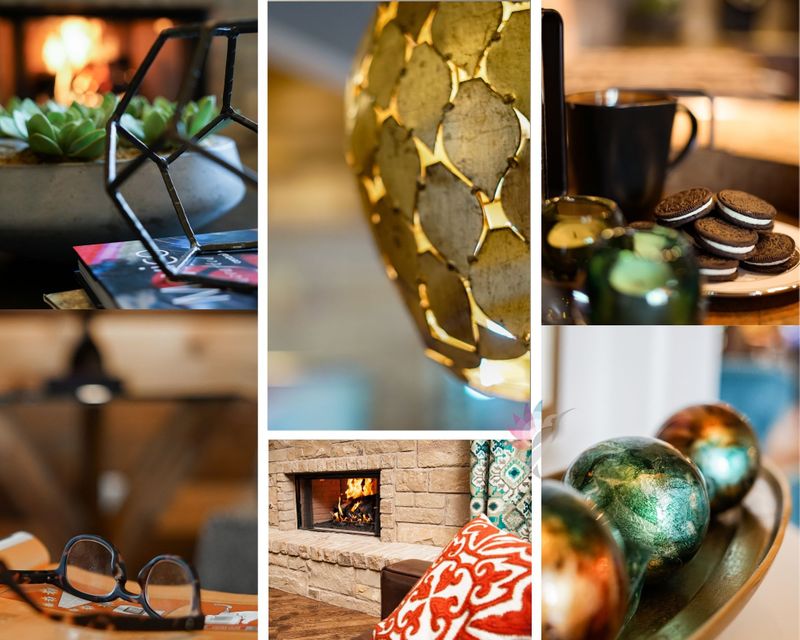
We decided to add professional draperies in the living room as well as the dining room. The aim was not to use the same fabric, but since the rooms were right next to each other, it was important to use fabrics that would complement each other. I used the accessories they already had in the house elsewhere and added a few new items, purchased at places like Home Goods and Hemispheres.
The artwork had just a touch of warm orange to it, but the orange related to the warm wood colors of the floors and the distressed wood panels on the large accent wall. I didn’t use the decorative bottles on the right side of the picture since it was too small in scale.
Color Inspiration
When planning a color scheme, a good rule of thumb is to divide the colors into 60% 30% 10%
In this room, brown was far more dominant and would be described as 60% of the color scheme. The green was used at about 30% and was softened by neutral linen/stone colors and then I added just a bit of orange (10%) in order to make sure we tie it in, since it was in several of the artwork pieces, some of her décor and in the wood panels. I was not going to focus on the purple in the artwork at all.
In the picture below, you will notice that the fabric for the dining room curtains, repeated the greens and even had some gold in the print as well. Gorgeous!
The dining room is adjacent to the living room and we used the same fabric for some of the accent pillows on the sectional in the living room to pull the colors through. I repeated the bronze and brass throughout the décor
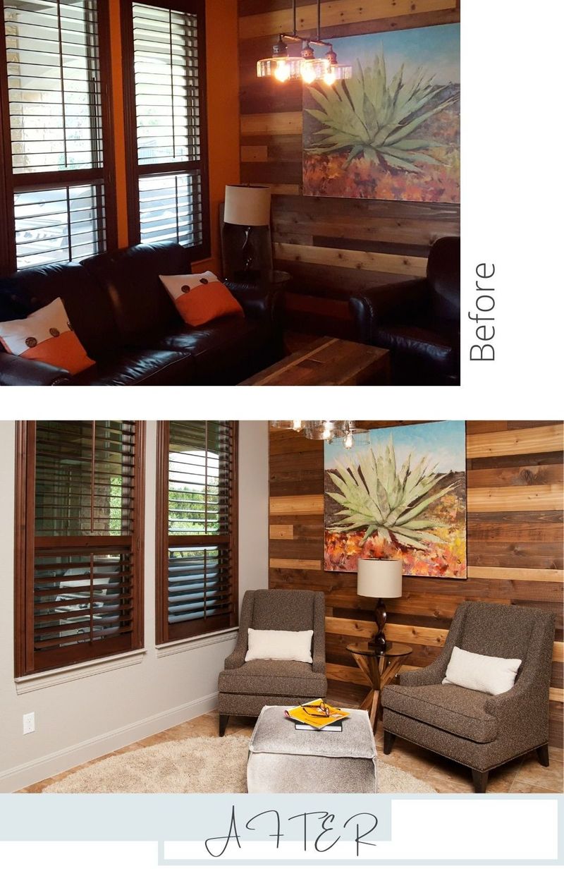
The reading corner next to the dining room were the only walls that have been repainted. The walls were a very bold orange before, but we freshened it up by painting it the same as the rest of the walls instead of leaving it orange. I repurposed furniture that was elsewhere in the house and now this room is not visually heavy and dark anymore.
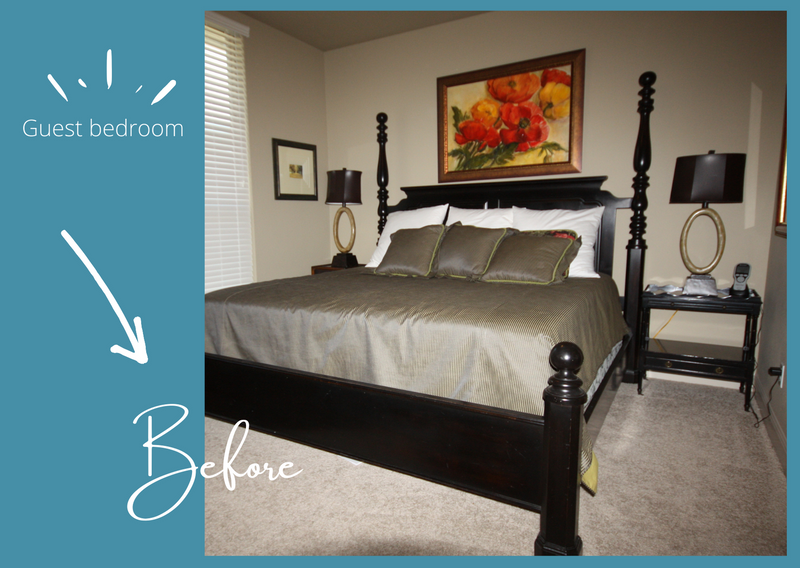
The guest bedroom was visible from the dining room and right next to the reading room, so I had to make sure that it would still flow visually when the door is left open without looking too matchy-mathcy. We used the same furniture, but I replaced the lamps and the linen. I was thrilled when I found the butterfly prints on Amazon! The colors were perfect with the new duvet colors!
I still used orange and turquoise but added more white to the palette to give it a fresh look and the wall colors had to stay the same as before. They did not want to repaint
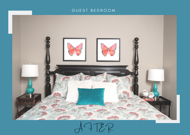
I found the turquoise chairs upstairs and moved them down to the foyer. The art print with the exact colors that I was working with, was hidden in a closet and I moved the brass lamp from elsewhere in the house to this area! Perfect! It pulled the existing color scheme through from the front door all the way to the guest bedroom.
She had most of these items in the house already, it was just a matter of organizing them and repurposing them!
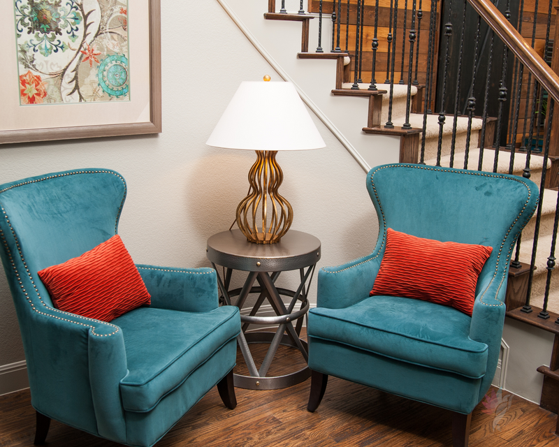
The aim was to repeat all these colors throughout the house in order to create a cohesive space. Bronze, warm browns, turquoise and orange.
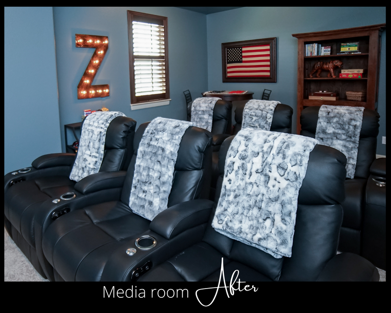
The only area upstairs that has undergone a major change was the media room. It used the be their two girls’ playroom but now that they are all grown up, the family wanted a designated movie area. We didn’t really aim for a fancy design, and at this point, it was undecided if they were willing to invest in a large surround sound TV system with all the bells and whistles, so we just decided on creating a decluttered and functional space.
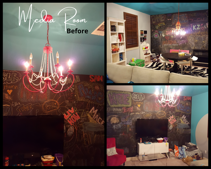
The girls chose the wall color (with a little bit of my unsolicited guidance) They wanted blue and I wanted them to choose a blue with a deeper value, but not really dark.
So we settled on Smokestack Gray from Benjamin Moore 2131-40. We ordered comfy top-grain black leather theatre seats, which everyone loved since it had USB ports and the purple lights at the bottom of the chair were a bonus! 😊 The rest of the furniture was brought in from other rooms and we created a game area since this was one huge room!
The most expensive part of the redesign project was adding professional draperies, but I am sure you would agree that it was necessary to create the design look they wanted!
If you need help making your home look like a model home, do not hesitate to contact me now! Together we can do it!